The Sports Illustrated Redesign
January 2016–July 2016
Problem
After relaunching SI.com in June 2014, users consistently reported the site to be cluttered, difficult to navigate, and slow. As part of the Sports Illustrated product team, we were eager to revamp the site to make it a best-in-class platform for sports content.
Solution
We sought to design and build a fully redesigned, fast, focused, sophisticated SI.com where fans could experience Sports Illustrated's unique point of view and get the sports news they wanted everyday.
The New SI.com
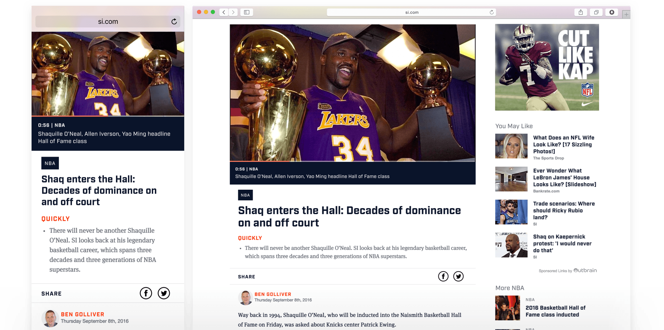
Articles
The bread-and-butter of Sports Illustrated is its high quality sports journalism. Combine that with the web's ever-growing social and search traffic patterns, and we really wanted the articles to be constructed from beautiful, readable components.
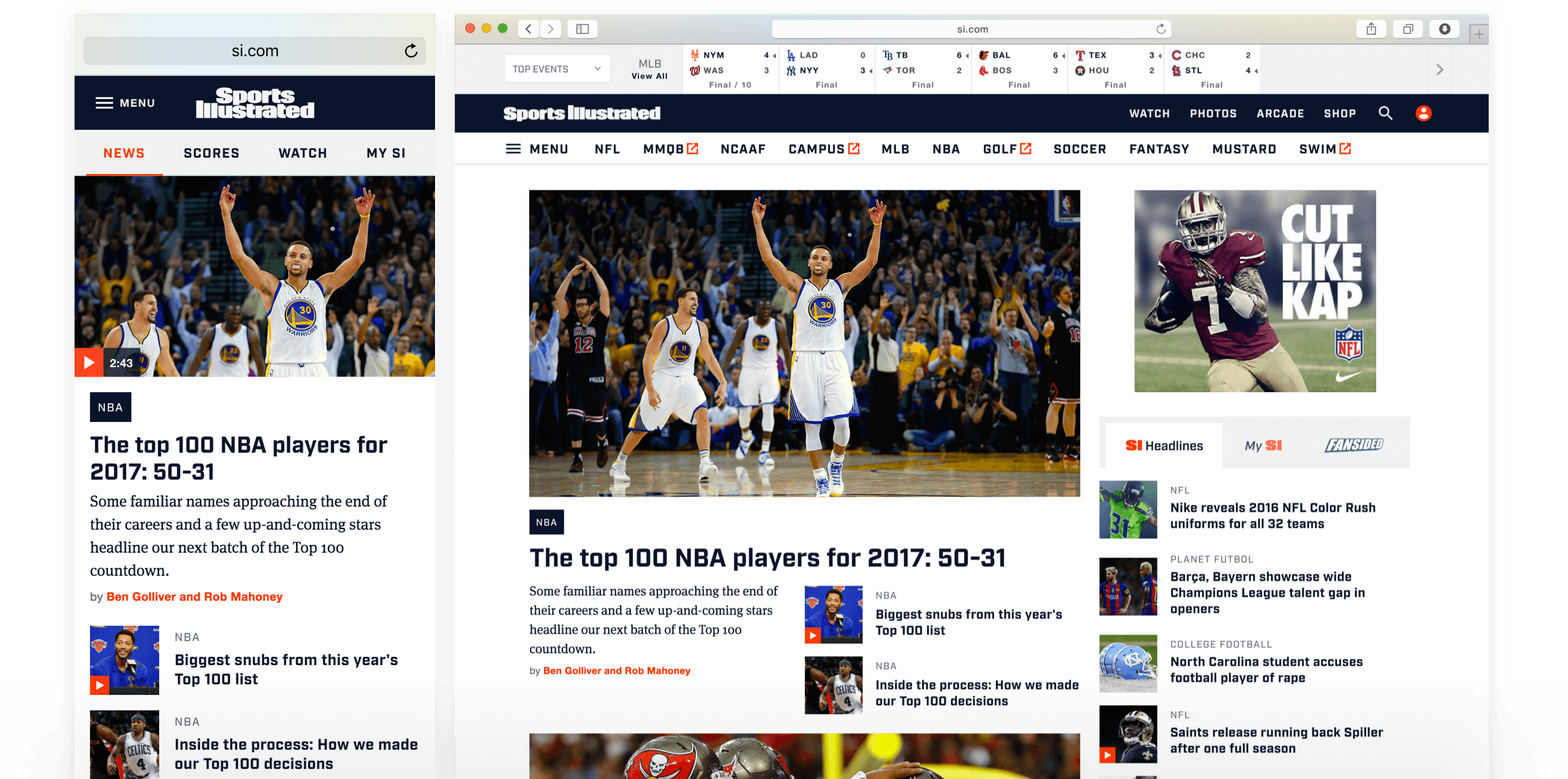
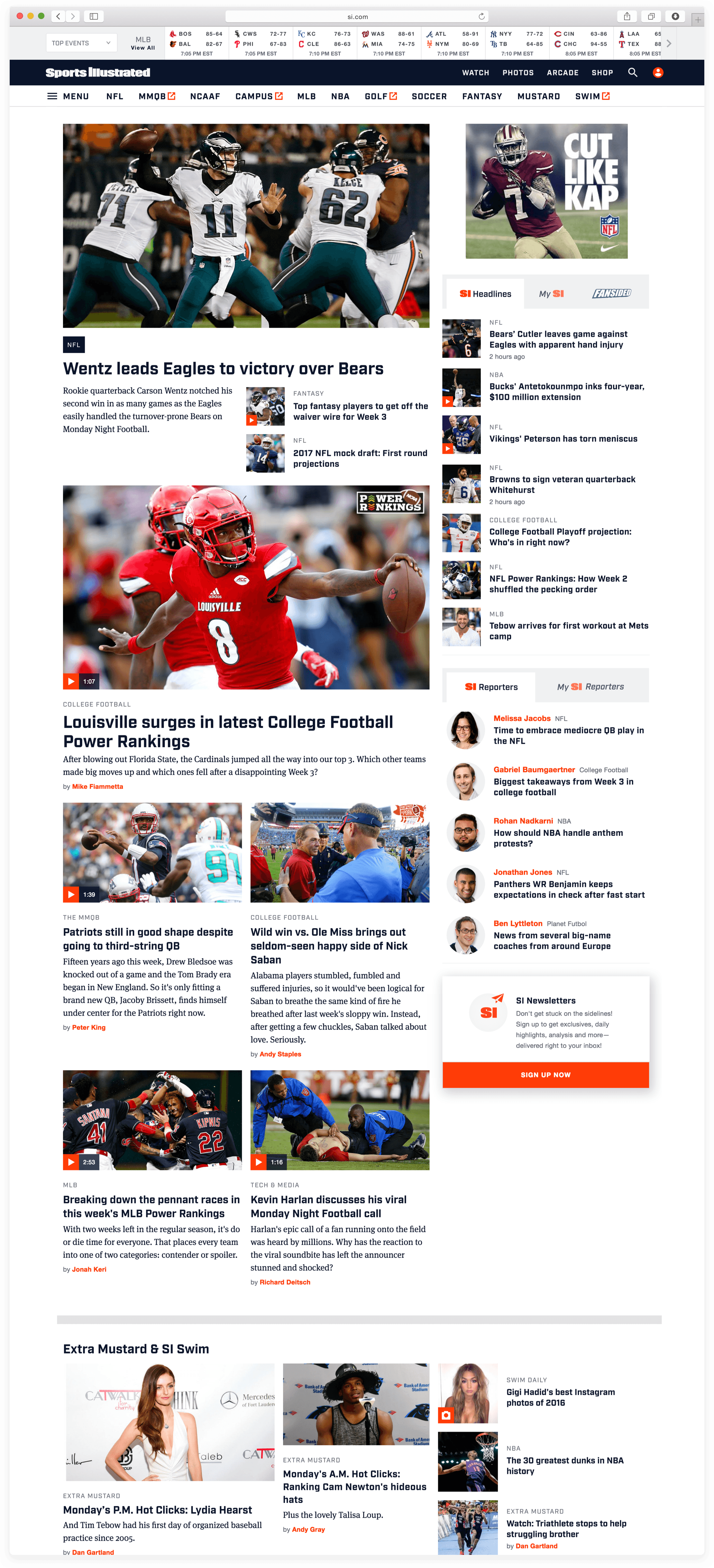
Home Page & Section Fronts
Though social & search traffic are increasing, Sports Illustrated still has many loyal users who visit the home page directly. Balancing user needs with editorial flexibility, all while making sure we met business requirements on ad inventory and viewability, became our primary challenge when designing components and layout logic for the home page.
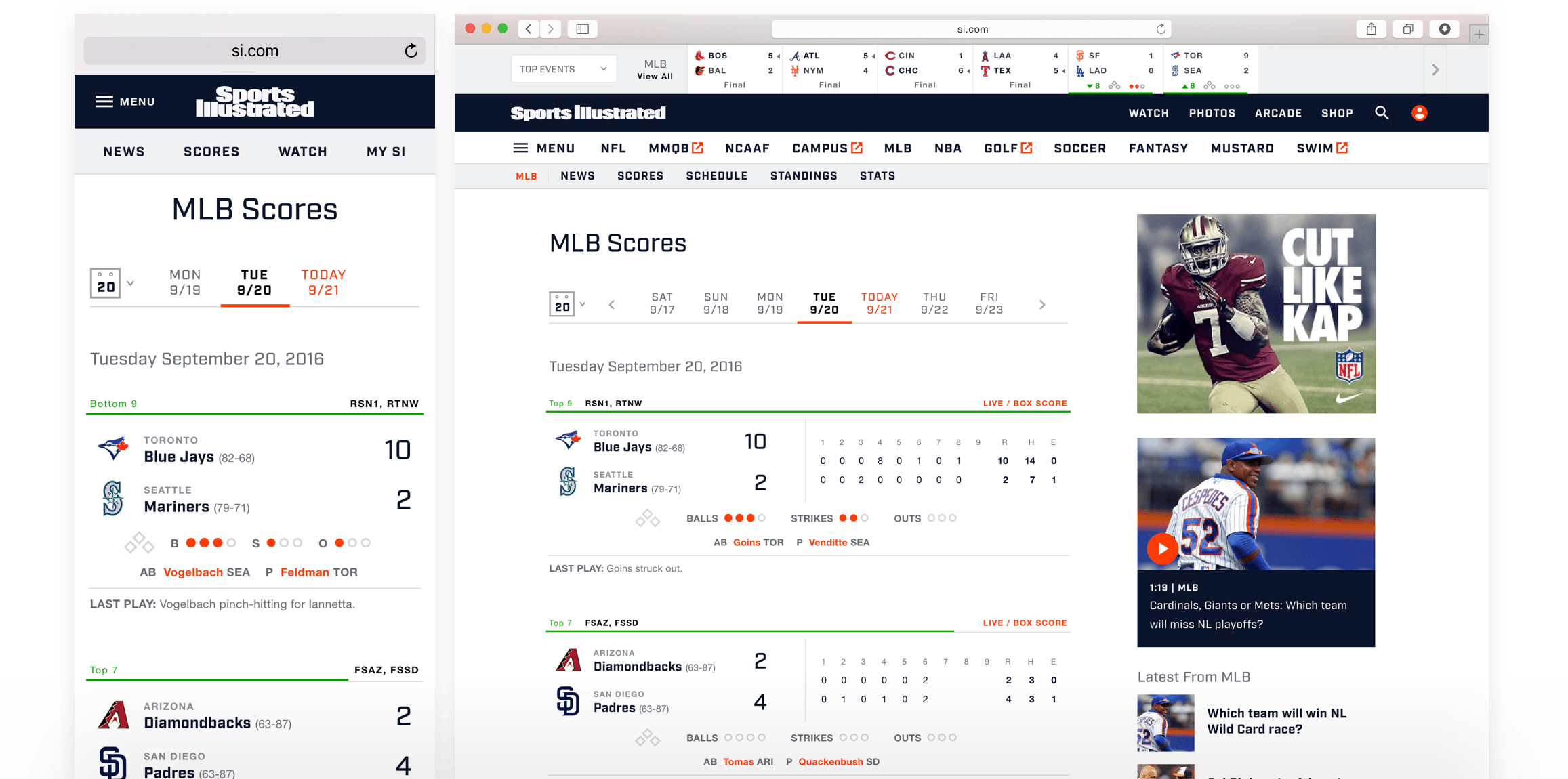
Sports Data
While Sports Illustrated can't compete with the depth of sports data offered by the likes of ESPN, we know a significant segment of our users seek out scores, standings, and other statistics from us. Our goal was to present the data in as clean and straightforward way as possible.
Photo Galleries
After several rounds of usability testing, coupled with analytics data from other sites within the company, we settled on vertical layout to showcase our great sports photography.
My Role
User Research
I led the team's user research efforts, collaborating closely with the research department to create a comprehensive research strategy that included monthly usability lab sessions, a 3-week immersion-deprivation study, a focus group, and pre- and post-relaunch site intercept surveys.
For the usability sessions in particular, I spent a good bit of time thinking and tinkering with how we conducted the tests and shared the results. In the past, learnings gleaned from these studies were often ignored almost immediately. Some of my experiments included:
- Writing notes on color-coded sticky notes (blue = positive, yellow = netural, red = negative) instead of tucked away in Google Docs or notebooks (thanks to the Sprint book for this one).
- Inviting members outside of the design team to actively participate in order to build up a shared understanding in real-time (instead of glazing over a written report generated a day or two later).
- Holding a debrief meeting immediately following the last session to discuss and priortize the key findings.
- Document the research in a shared space (for our team, this was in the wiki software Confluence) with links to the final report, pre-survey screener, task list, photos of the sticky notes, and full videos of each participant.
While there's still work to be done, user research did become much more ingrained in our process than ever before.
Design & Engineering Collaboration
I worked to improve design & engineering collaboration by shifting the team's energy from static comps to spending more time deciding in the browser. I also spearheaded team workshops on content modeling, performance budgets, and shared naming conventions.
Designers Should Code
I'd messed around Git before, but never in a way that allowed me to ship code to production consistently. So through a bit a trial-and-error and a whole lot of Stack Overflowing, I gradually familiarized myself with the command line and the basics of Git. There still tons I need to learn but, and not that I'm competitive or anything, I'm currently sitting at 5th most code commits for the team in the new site's repo.
Creating a Component Library
I also pushed the team to think about building components outside the context of page layout in order think of them more in terms of extensible, atomic units. I built the beginnings of a component library in Sketch in order to be able to evaluate the design system as a whole. It also helped us rapidly spin up prototypes for usability testing and stakeholder reviews.
Bringing Structure to Design Critiques
We all know the pain of unhelpful design critiques, where the conversation veers off course and little gets accomplished. Time is wasted and egos get bruised. Having sat through one too many of these, I could see a clear pattern emerging when critiques started to go awry—a lack of structure to the critique process. So while leading this project, I experimented with critiques that set a clear goal at the outset and allowed the team some quiet time to review the work before the designer spoke. While we continue to re-evaluate our design critiques, I think we ultimately shipped a better product because of it.